New approaches to trauma reporting (with example & template)
For many trauma professionals, data reporting is as overwhelming as it is essential. Many trauma program managers and PI coordinators find themselves spending a...

For many trauma professionals, data reporting is as overwhelming as it is essential. Many trauma program managers and PI coordinators find themselves spending a week preparing reports for a one-hour meeting.
New approaches to trauma reporting are challenging the long-held assumption that quality trauma reporting must be difficult and time-consuming to produce.
Table of Contents
- The Challenge
- The Solution
- Best Practices
- Pre-built Report Examples
- Key Components
- Example Report
- Free Template
- Conclusion
In this guide, we're exploring how modern approaches to trauma data reporting—including presentation-ready reports and other approaches—can transform this process, reducing preparation time while delivering impactful results.
We've put together a detailed example presentation, a PowerPoint template, and highlighted modern software alternatives to assist busy trauma teams gather, analyze, and communicate trauma insights more effectively and efficiently.
Let's dive into modern approaches to trauma data reporting.
The Challenge: Traditional Trauma Reporting
Traditional approaches to trauma reporting presents several significant challenges:
- Time-intensive process: Preparing comprehensive reports can take a significant amount of time to create
- Specialized skills required: Report creation typically demands not just an understanding of specialized trauma care but also proficiency in specialized, often hard-to-use reporting software
- Manual repetition: Each new report often means starting from scratch
- IRB approval hurdles: Getting data approved for IRB can be cumbersome
- Limited flexibility: Difficult to make quick changes when stakeholders request modifications
- Visual reformatting burden: Output from traditional systems often produces unattractive, poorly formatted data that requires significant time to transform into visually appealing presentations
- Explanatory overhead: Raw data exports lack context and explanation, forcing trauma team members to spend additional time interpreting and annotating findings for stakeholder comprehension
"It takes you a full week to put together this meeting that lasts one hour..."
Trauma Program Manager on preparing data for meetings
The Solution: Modern Trauma Reporting Practices
Modern trauma reporting solutions offer a dramatically different experience:
- User-friendly software: Reporting software that is more intuitive to use than previous generations
- Pre-built reports and templates: Start with professionally designed reports rather than a blank page
- Presentation-ready outputs: Reports designed to be shared immediately in presentation formats
- Intuitive customization tools: Create tailored reports through user-friendly interfaces without specialized technical skills
- Quick modifications: Make parameter changes even during meetings
- Interactive and automated features: Generate dynamic reports that stakeholders can explore
- Scheduled generation: Automate routine reporting
The result?
"So if we can pull these reports, and it's presentation-ready, and it's: 'Yes, this is what I want for this meeting' and just click and drag it over there. It's going to be a time saver for sure and a stress reducer for people like me."
Trauma Program Manager on presentation-ready reports
Best Practices for Efficient, High-Impact Trauma Reporting
Time-Saving Strategies
- Start with templates: Begin with pre-built reports rather than blank pages
- Start with presentation-ready templates: Begin with professionally designed, shareable reports
- Establish a data library: Maintain standardized visualizations and tables
- Create reusable queries: Build queries once and modify parameters as needed
- Schedule automatic generation: Set up recurring reports for routine meetings
- Develop stakeholder-specific views: Create tailored reports for different audiences
Common Pitfalls to Avoid
- Data overload: Presenting too much information without clear focus
- Missing context: Failing to provide benchmarks or historical comparison
- Neglecting actionable insights: Reports without clear next steps
- Poor visualization choices: Using inappropriate chart types
- Inconsistent formatting: Changing report structures between periods
Examples of Essential Pre-built Reports
We believe the new generation of trauma reporting software should include critical reports such as these—and more—as pre-built reports, to dramatically reduce preparation times.
- Trauma Registry Monthly Performance Dashboard: A snapshot of key performance indicators
- Registry/TRP Dashboard: Centralized view of registry metrics
- OPPE Dashboard: Provider-specific performance and quality metrics
- Quarterly Mortality Review Summary: Comprehensive analysis of mortality cases
- Annual Injury Pattern Analysis: Trends in injury mechanisms and patterns
- PI Committee Meeting Executive Summary: Focused overview for performance improvement
- Length of Stay (LOS) Trend Analysis: Patterns in patient hospitalization duration
- Injury Severity Score (ISS) Distribution Report: Analysis of patient acuity
- Response Time Compliance Report: Metrics on team activation and response
- Protocol Adherence Analysis: Evaluation of compliance with established protocols
Components of Presentation-Ready Trauma Reports
Modern trauma reporting isn't just about collecting data—it's about presenting information in ways that communicate insights well and drive action.
Presenting trauma data effectively means combining multiple components to transform complex information into clear insights that drive understanding and action. Here are components you might consider for your next presentation:
1. Data Story/Summary
Consider beginning every trauma report with a compelling summary that provides context:
- Executive Summary – A concise overview of key findings, designed for quick comprehension.
- Trend Analysis – Compare current data with previous periods to identify patterns.
- Actionable Recommendations & Next Steps – Outline specific steps for improvement based on findings.
- Benchmark Comparisons – Compare performance against national/regional standards (e.g., TQIP data).
- Impact on Patient Outcomes – Explain how the trends and findings affect patient care and system efficiency.
2. Data Tables
Well-structured tables provide the quantitative foundation:
- Key Metrics Summary – Displays mortality rates, compliance measures, and performance indicators.
- Comparative Period Analysis – Tracks changes over time (e.g., quarter-to-quarter or year-over-year).
- Demographic Breakdowns – Includes age, gender, and injury severity distribution of patients.
- Quality Indicator Tracking – Monitors adherence to key standards (e.g., trauma team activation compliance).
- Resource Utilization Statistics – Analyzes use of ICU beds, OR time, blood product consumption, etc.
3. Visualizations
Visualizations can transform complex data into intuitive insights. See examples of many of these charts in our example presentation below as well as in the PowerPoint template.
Trend Line Graphs – Best for showing changes over time, identifying patterns, and tracking progress toward goals. Examples: Trauma mortality rates over quarters, average response times by month, or complication rates following protocol changes.
Pie Charts – Best for displaying proportional relationships within a whole (100%), especially with limited categories (5 or fewer). Examples: Mechanisms of injury distribution, preventability classification percentages, or disposition breakdown of trauma patients.
Bar / Column Charts – Best for direct comparisons between categories and showing ranked data. Excellent for period-over-period comparisons (month/year-over-year). Examples: Current vs. prior year mortality by quarter, this month's compliance rates vs. benchmarks, or outcomes by service line with historical comparison.
Distribution Charts (Histograms, Box Plots) – Best for showing how values are distributed across a range and identifying outliers. Examples: Age distribution of trauma patients, ISS category breakdown, or length-of-stay variation.
Scatter Plots – Best for exploring relationships between two variables (your x and y axis) and identifying potential correlations and outliers. Examples: ISS vs. mortality correlation, blood transfusion volume vs. patient outcomes, or age vs. length of stay.
Radar/Spider Charts – Best for comparing multiple variables simultaneously and visualizing performance across several dimensions. Examples: BAC levels by month showing seasonal patterns, compliance with multiple trauma protocols, or comparing service lines across several quality metrics.
Geographic Maps with Data Layers – Best for visualizing spatial data, identifying location-based patterns, and communicating regional variations. Examples: Injury locations within your catchment area, response time heat maps by district, or pedestrian injury hotspots for prevention planning.
4. Performance Improvement & Action Planning
Communicate meaningful change:
- Quality Improvement Opportunities – Highlight process breakdowns and system inefficiencies.
- Action Plan / Next Steps – Outline specific interventions with timelines and responsible parties.
- Loop Closure Tracking – Document how previously identified issues have been resolved.
- Education & Training Implications – Identify areas where additional staff training is needed.
5. Outcome & Data Analysis
Add deeper insights into trauma care outcomes:
- Risk-Adjusted Outcome Measures – Compare actual vs. expected mortality rates (e.g., TQIP O/E ratios: Observed to Expected ratios where Observed (O) is the actual number of events (like deaths, complications, or other outcomes) that occurred in your patient population and Expected (E) is the predicted number of events based on risk-adjustment models that account for patient factors such as age, injury severity, comorbidities, and other risk factors.).
- Mortality & Complication Trends – Track long-term improvements or areas of concern.
- Unexpected Outcomes Analysis – Identify unexpected survivors and unexpected deaths.
6. Operational & Compliance Monitoring
Present adherence to trauma protocols and efficient resource use:
- Compliance Tracking Indicators – Measure adherence to trauma center standards (e.g., “Trauma surgeon arrival <15 min: 92% compliance”).
- Resource Allocation Insights – Assess efficiency of personnel, operating rooms, and critical care resources.
- EMS & Prehospital Data Integration – Evaluate how prehospital care contributes to outcomes (e.g., scene times, airway interventions).
7. Stakeholder-Specific Insights
Tailor trauma reports to different audiences for more impact.
- Executive Summary for Leadership – High-level insights for hospital administrators.
- Multidisciplinary Feedback Integration – Include perspectives from surgeons, ICU teams, EMS, and nursing.
- Clinical Care Considerations – Highlight actionable takeaways for frontline providers (e.g., protocol adherence, patient safety trends).
- Research & Data Analysis Opportunities – Identify areas for clinical research, registry studies, or performance benchmarking.
- Legal & Risk Considerations – Ensure documentation aligns with accreditation, compliance, and legal standards.
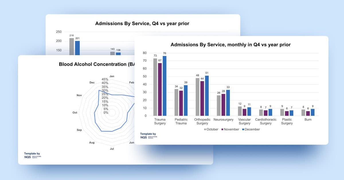
An Example Report Presentation: Trauma Metrics Meeting
Let's review an example trauma metrics meeting presentation. Let's examine visualizations for key trauma metrics including hospital events (complications), admissions by service, mortality rates, arrival-to-OR times and more.
Slide 1
Trauma Meeting Metrics Q4
Silverleaf Trauma Center
Slide 2
Trends & Anomalies
- Arrival-to-OR times improved 17.9% from 1091 to 896 minutes year-over-year, with December showing the greatest improvement despite increases in both October and November.
- Pneumonia cases increased 10.5% (38 to 42) while ARDS cases decreased 5.1% (39 to 37).
- Pediatric trauma volume increased 12.9% Q4 versus year prior.
- Multi-Organ Failure (MOF) maintained highest mortality rate at 33.3%, while case numbers decreased from 14 to 12 cases year-over-year.
- Vascular Surgery trauma cases rose 14.3% from 28 to 32 cases, coinciding with the overall trend of shorter arrival-to-OR times.
- **Overall complications-to-admissions ratio decreased from 53.2% to 49.7% **year-over-year, while total trauma volume increased 6.4%.
- **Burn service admissions increased 16.7% **from 18 to 21 cases, while burn-related complications decreased 20% during the same period.
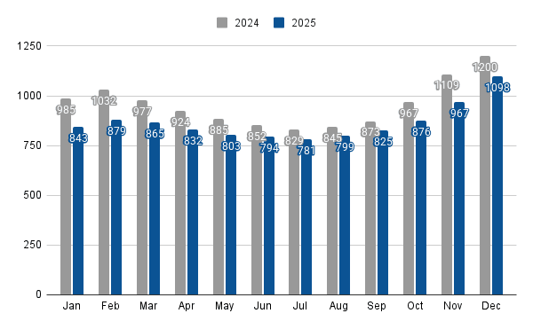
Slide 3
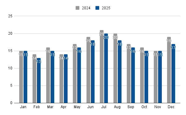
Trauma Patients, year to date vs year prior
Speaker Notes: The data shows consistent year-over-year growth in trauma patient volume across all months (with an overall increase of 6.7%), with the highest volumes occurring during summer months (June-August) in both years and July 2024 showing the most substantial increase at 8.7% over the previous year.
Slide 4
Trauma Activation Year to Date
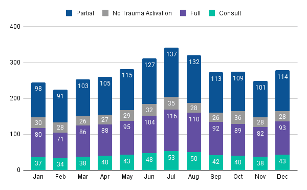
Speaker Notes: Consistent with overall trauma volume patterns, both partial and full activations show pronounced seasonal variation with peak volumes in summer months (July has the highest numbers at a combined 253 activations), while maintaining a relatively stable ratio of approximately 55% partial to 45% full activations throughout the year.
Slide 5
Transfers Year to Date
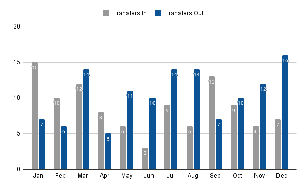
Speaker Notes: Note the imbalance in winter months (December had 16 out versus 7 in) contrasted with September's positive transfer balance (13 in versus 7 out).
Slide 6
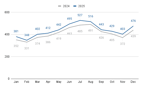
Trauma Mortality, year to date vs year prior
Speaker Notes: The mortality data shows an overall positive trend with a consistent reduction in mortality rates across all months in 2025 compared to 2024, despite maintaining similar seasonal patterns in absolute death counts, with both years showing peak mortality in July and higher counts during summer months.
Slide 7
Admissions By Service, Q4 vs year prior
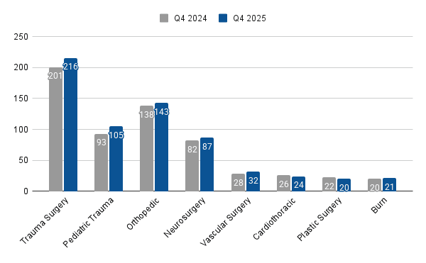
Speaker Notes: Pediatric trauma cases increased 12.9% in Q4 vs prior year.
Slide 8
Mechanisms of Injury, year to date
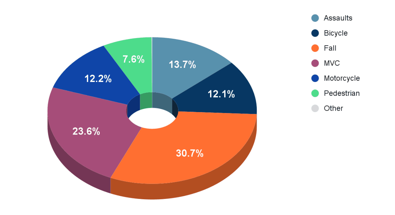
Speaker Notes: Falls are consistently the predominant mechanism of injury at 30.7% for the year, followed by motor vehicle crashes at 23.6%
Slide 9
Blood Alcohol Concentration (BAC), year to date
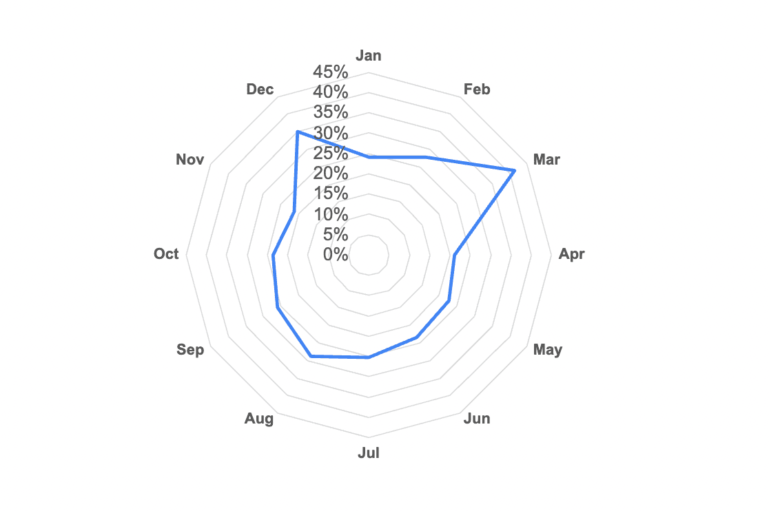
Speaker Notes: BAC incidents during March (41.3%) and December (35.0%), suggesting a potential correlation between holiday periods and elevated alcohol-related trauma cases that warrants further investigation.
Slide 10
Bicycle Injuries By Area, year to date
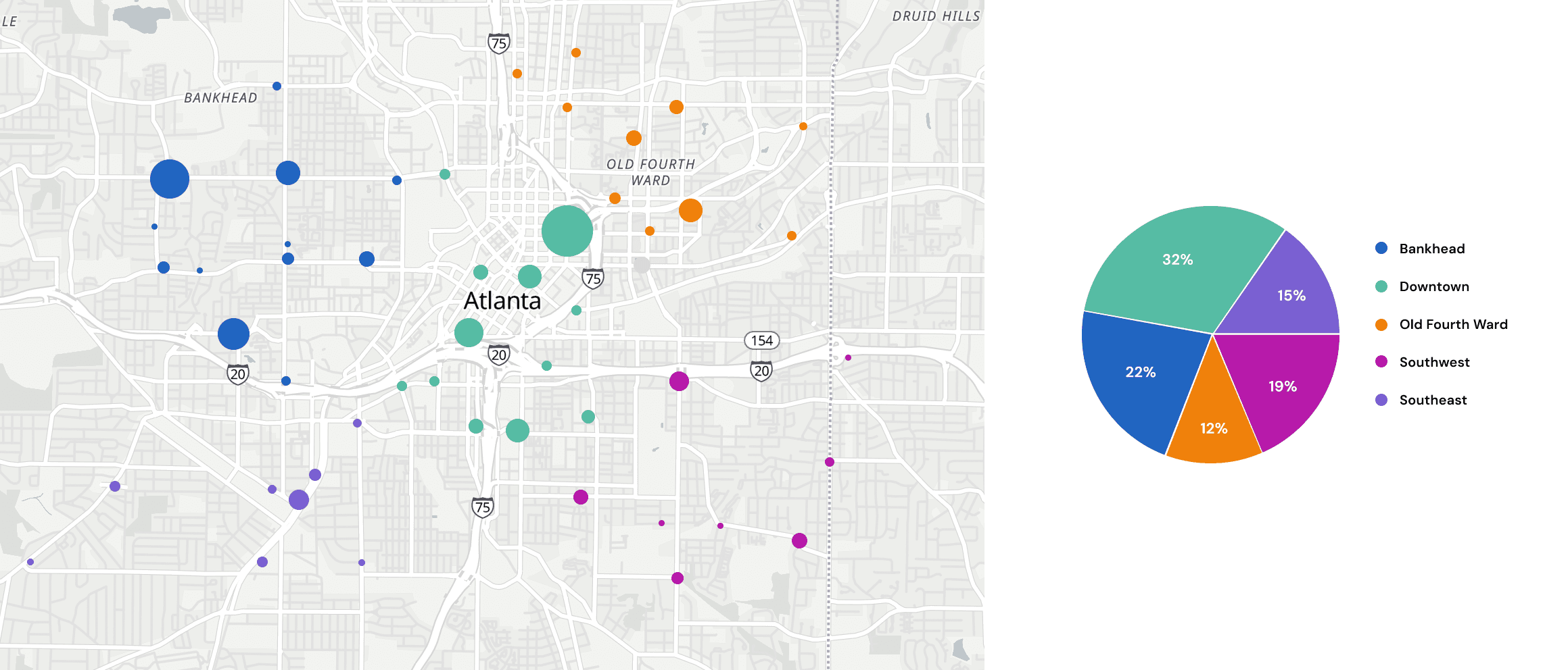
Speaker Notes: Downtown accounts for nearly one-third of all bicycle injuries (32%), while Southwest has the lowest incidence at just 12%, suggesting a need for targeted safety interventions in high-traffic injury locations.
Slide 11
Arrival to OR, avg time in mins, year to date vs year prior
Speaker Notes: The arrival-to-OR data reveals a consistent seasonal pattern across both years, with winter months (particularly November-February) showing significantly longer wait times compared to summer months, though 2025 demonstrates a substantial improvement overall with an average 9.6% reduction in wait times across all months compared to 2024.
Slide 12
Hospital Events, Q4 vs year prior
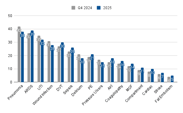
Speaker Notes: There's a notable increase in pneumonia cases (38 to 42) while ARDS cases decreased slightly (39 to 37), suggesting a possible shift in respiratory complications despite an overall increase in most complication categories.
Want a PowerPoint template version of the charts above? Get it below:
Get a Free Trauma Report Presentation PowerPoint Template
Want a version of the Trauma Metrics Meeting presentation above to modify for your next meeting? Get the PowerPoint template below. You can edit the chart data inside PowerPoint.
Note 1: Slide 10's bicycle injury map above is not in the PowerPoint template due to PowerPoint limitations. But there is an extra slide and chart not seen above.
Note 2: Want a modern trauma registry software platform with pre-built and presentation-ready reports built-in? Including pre-built injury maps? demo.
Loading form…
Conclusion
The transition from traditional to modern trauma reporting represents more than just a technological shift—it's a fundamental change in how trauma programs approach data management and communication. By embracing presentation-ready reporting tools and approaches, trauma professionals can:
- Reduce report preparation time from one week to a few hours
- Improve stakeholder communication and engagement
- Maintain consistent, high-quality reporting standards
- Focus more time on quality improvement initiatives
- Respond dynamically to changing information needs
For trauma program managers, PI coordinators, registry staff, and quality improvement teams, these modern approaches offer a path away from data reporting drudgery and toward impactful, efficient trauma program data management.
The days of spending a full week preparing for a one-hour meeting can be left behind. With modern trauma reporting solutions, teams can deliver more value with less effort—leaving more time for what matters most: improving trauma care and patient outcomes.
See What Modern Trauma Reporting Looks Like
NQS is dedicated to this mission of empowering trauma teams with modern tools for clinical intelligence. demo.