![]()
A trauma performance dashboard makes it easier to visualize key metrics, spot concerning trends, and track progress over time. But what metrics and formulas should you include? How do you populate it with registry data?
I’ve created dozens of these dashboards over the years for trauma programs around the US. And I’d love to help you speed up the process.
In this post, we’ll walk you through building your own trauma dashboard. We’ve put together a video takes you step by step. I also provide a pre-built Excel PI dashboard template that you can download. It contains the essential organization and metrics to get you started quickly.
We’ll cover how to select the right metrics, tallying the metrics from your registry data and setting up colored scorecard formatting.
Let’s get started!
Just want the free Excel trauma performance dashboard template? Get the template here
Note: Want an alternative to manual dashboards? Want a modern dashboard built from your registry data, instantly updates when you import your data, and gives you instant, one-click drill-down reports? Check out the NQS Standalone Dashboard.
Why Create a PI Dashboard?
A thoughtfully designed trauma dashboard provides many benefits for oversight, analysis, team communication and performance gains. Such as:
Timely visibility into trauma program performance
Don’t be surprised by performance data you’d otherwise receive months later.
Track metrics over time
See whether progress is being made or if a potential problem is building.
Identify problem areas
See problem metrics at a glance with red / green scorecard styles.
Engage stakeholders with data visualizations
Easier data visualization means easier promotion, understanding and buy-in from everyone on your team.
Supports data-driven decision making
The timelier & clearer your data, the more proactive your team can be in improving performance.
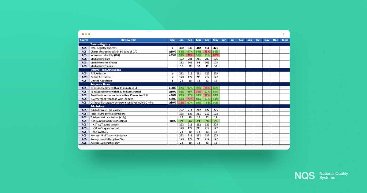
Download and Use Our Excel Template
Instantly download our trauma PI dashboard as an Excel file.
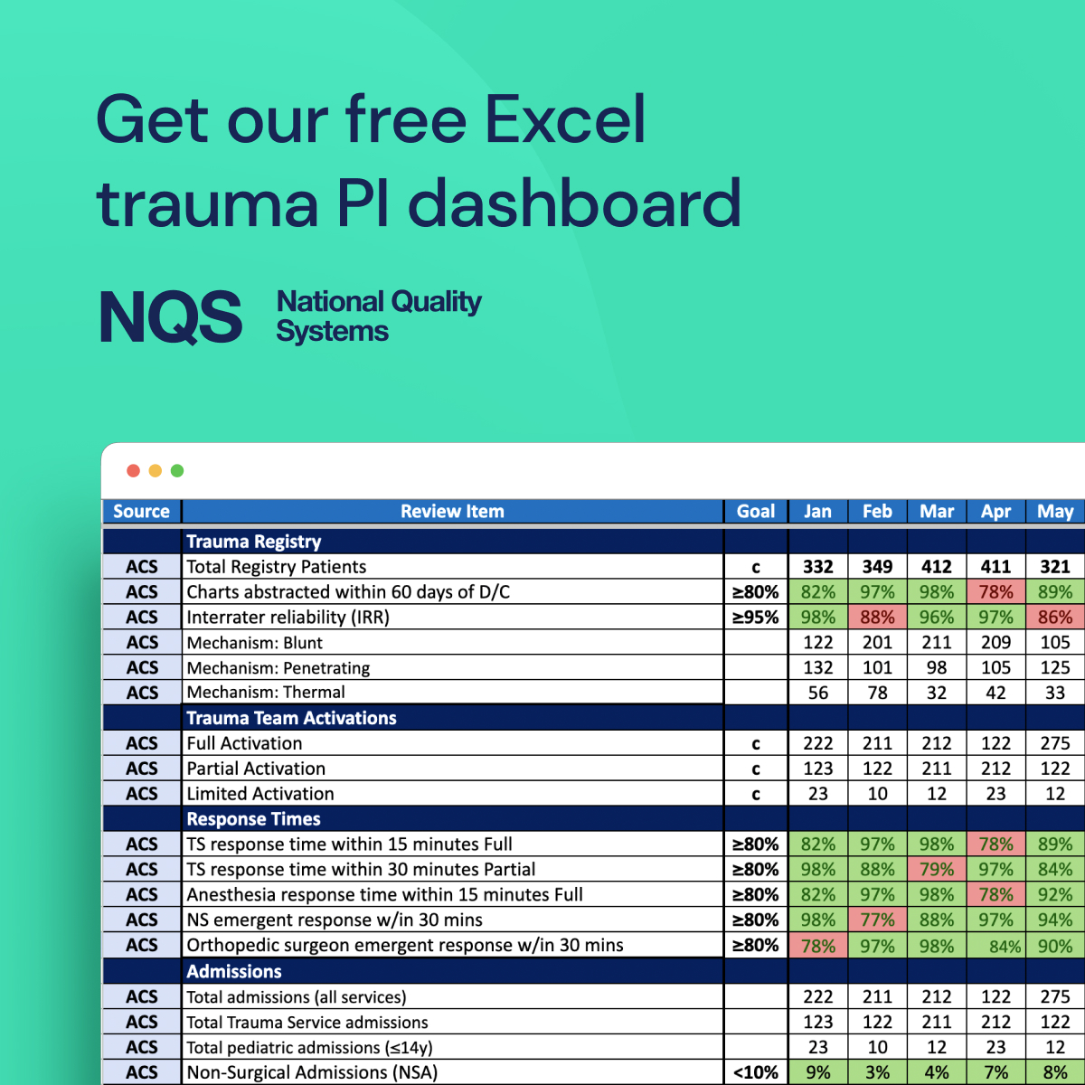
This Excel download includes the grouped rows and columns to get you started quickly. This is the same template I use as a starting point for my dashboards. Access it here:
What metrics should be included in our trauma PI dashboard?
Download our template to see the exact organization and rows of metrics we use as a starting point.
We start with the general measurements (demographics of number of patients, number of abstractions within 60 days, activations, response times, admissions, etc…). We recommend then grouping categories by Phases of Care (prehospital, ED, OR, ICU, floor…), Specialties (ortho, neurosurgery, trauma…) followed by the TQIP Complications (AKI, CAUTI, Severe Sepsis…). Download our Excel template with the full list we suggest.
Why organize it this way?
Phases of Care are the responsibility of the department leaders in those areas (in collaboration with the trauma program), Specialty metrics are the responsibility of the specialists (ortho, neuro, etc. – in collaboration with the trauma program).
Here is the broad outline:
- General
- Phases of Care
- Specialties
- TQIP Complications
You can then add rows for additional state, system and facility custom measurements, as needed.
How to add metrics to your Excel trauma dashboard? (video)
We’ve created a video walkthrough from export of your registry to adding metrics to your dashboard:
We walk you through setting up your trauma performance dashboard in Excel. These are the big picture steps:
- Export data from your trauma registry in Excel format (Excel document #1)
- Identify empty fields
- Filter for your count and percentage metrics (use our 85 metrics cheatsheet for guidance)
- Add the values to your Excel dashboard (Excel document #2. Get our template here.)
- Set up conditional formatting for red/green scorecard view for metrics with goals
- Repeat the above every month
What is the process for adding trauma registry data to an Excel dashboard?
Ok, we have the rows of metrics that we want for the dashboard. Now it’s time to populate them with real data.
Here’s the overview:
Run a report – or reports – from your ESO, ImageTrend or other trauma registry software, including as many of the data fields you need. Export as an Excel file. This is your Excel file #1.
You will sort the data within this Excel document to tally each metric and manually add those values to your Excel dashboard (Excel document #2). We’ve created this cheatsheet to help speed this up for you.
Add conditional formatting for metrics that have goals so that you can see at a glance whether you are hitting those goals or not.
Sadly, this involves a lot of manual effort. (Wish there was an easier way? You might be interested in NQS’s trauma platform and its live cohort dashboard.)
How do we determine the right formulas for our metrics?
The first question in determining how you define your metric formulas is: does your program want to show positive or negative compliance?
For example, I personally want to show how many times we are compliant rather than how many times we fail. However, I’ve seen many trauma programs reporting on failures rather than successes.
Example: Reporting on Successes
- Open fracture antibiotic given within 60 minutes of arrival
- Numerator: Antibiotics given within 60 minutes of arrival
- Denominator: Number of open long bone fractures
Example: Reporting on Failures
- Open fracture antibiotic not given within 60 minutes of arrival
- Numerator: Antibiotics not given within 60 minutes of arrival
- Denominator: Number of open long bone fractures
Which to choose? Choose to focus on successes or failures based on what motivates your team and aligns with your program’s goals. Both can be insightful. I personally choose to focus on successes.
Next, check out our cheatsheet for calculating 85 common trauma performance metrics here.
How to show scorecard colors via conditional formatting?
For rows that have goals, use conditional styling to color the cells for values that meet or do not meet the goal’s value. Users can easily scan the document and see which areas are not performing to expectations.
Green = meets the goal
Red = does not meet goal
Check out the video above that walks you through this conditional formatting. We’ve also outlined it below. How to set up conditional formatting in Excel for rows with goals, with cells turning green if the value meets or exceeds the goal and red if the value is below the goal:
- Select the cell you want to edit. Just one will do for now. We’ll extend it across all months in a later step.
- Access Conditional Formatting: Go to the ‘Home’ tab on the Excel ribbon and click on ‘Conditional Formatting’.
- Create a New Rule: From the drop-down menu, select ‘New Rule’.
- Select Rule Type: Choose ‘Format only cells that contain’.
- Set Conditions for Green: Under the ‘Edit the Rule Description’ section, set the rule to format cells where the cell value is ‘greater than or equal to’ the goal value, for example.
- Format with Green: Click on ‘Format’, choose the ‘Fill’ tab, select a green color, and click ‘OK’.
- Add Another Rule for Red: Repeat the steps to create a new rule, but this time set the condition for when the cell value is ‘less than’ the goal value.
- Format with Red: In the format options, choose a red color for the fill.
- Finalize and Apply: Click ‘OK’ to close the formatting windows and apply the rules. Excel will now automatically color the cells green or red based on whether they meet the goal criteria. Test it with low and high values.
- Select the cell and drag it across all months to apply to all.
Additional Questions
How can we visualize data to make it easily understandable for all stakeholders?
You can download our Excel PI dashboard template which has common metrics added and organized. Add in your data and the conditional scorecard coloring and you’ll have a tool for easier performance data visualization to collaborate with your team.
Can we automate the dashboard to update regularly?
If you use registry software such as ESO and ImageTrend, this can be a very manual process. If you’d like easier insights into your trauma data, you might be interested in learning more about our NQS trauma center platform here.
How can we customize the Excel template to fit our specific needs?
Modify the template by adding new rows for additional metrics or adjusting existing metrics, add formulas, and configure the layout to cater to your center’s unique requirements. Anything you can do in Excel, you can do in the template.
What is the best way to ensure data accuracy and integrity?
Regularly verify data sources, use data validation rules, and train staff on accurate data entry and updating processes.
How can we train staff to use and interpret the dashboard effectively?
Provide training sessions, create user manuals, and ensure ongoing support to help staff understand and utilize the dashboard.
Are there any privacy concerns we need to be aware of when using trauma data in Excel?
While we’ve discussed a dashboard that only presents aggregate-level, and not patient-level, data, always adhere to HIPAA guidelines. De-identify any patient data and use secure methods to store and share the dashboard.
What are the best practices for maintaining and updating the dashboard?
Review and refresh the data on a regular schedule (such as monthly), maintain clear documentation, and periodically check the dashboard for any needed enhancements or updates.
My cadence is usually this: since the registry is typically 60 days post-discharge, it usually takes a few weeks to close out a month’s worth of data.